Case study
ArabxNorthAmerica
Designing a community platform that helps Arabs connect, support each other, and feel at home across North America.
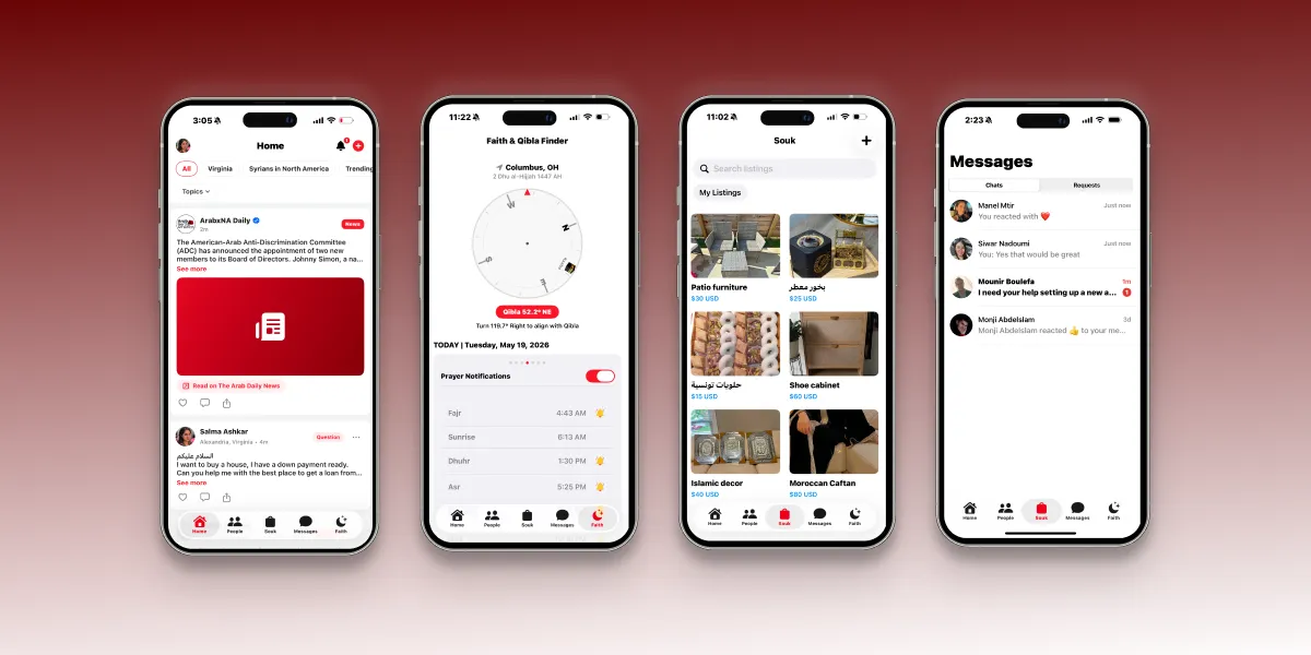
Overview
Responsibilities
- Product Strategy
- UX Research
- User Flows
- Wireframing
- UI Design
- Design System
- Prototyping
- Developer Handoff
The Problem
Moving to another country is exciting — but also isolating.
Many Arabs living in North America rely on dozens of Facebook groups, WhatsApp communities, and Telegram chats to find housing, ask immigration questions, buy furniture, discover halal restaurants, or simply meet people who speak their language.
Unfortunately these experiences are fragmented. Users constantly switch between apps to accomplish simple tasks.
The opportunity was to create one centralized platform that combines community interaction, marketplace functionality, messaging, and cultural tools into a single mobile experience.
Goal
Design an application that enables Arabs living in North America to:
- Connect with nearby community members
- Ask questions safely
- Buy and sell within trusted communities
- Find local information
- Stay connected through messaging
- Access faith-related tools without leaving the app
My Role
As the UX/UI Designer, I designed the product from the ground up. Responsibilities included:
- Defining the information architecture
- Creating user journeys
- Designing reusable components
- Building the design system
- Designing every major screen
- Improving usability through multiple iterations
- Collaborating with the developer to ensure implementation matched the design
Research
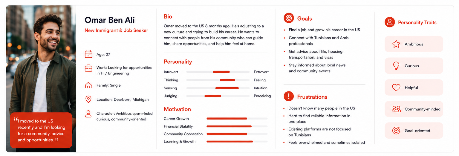
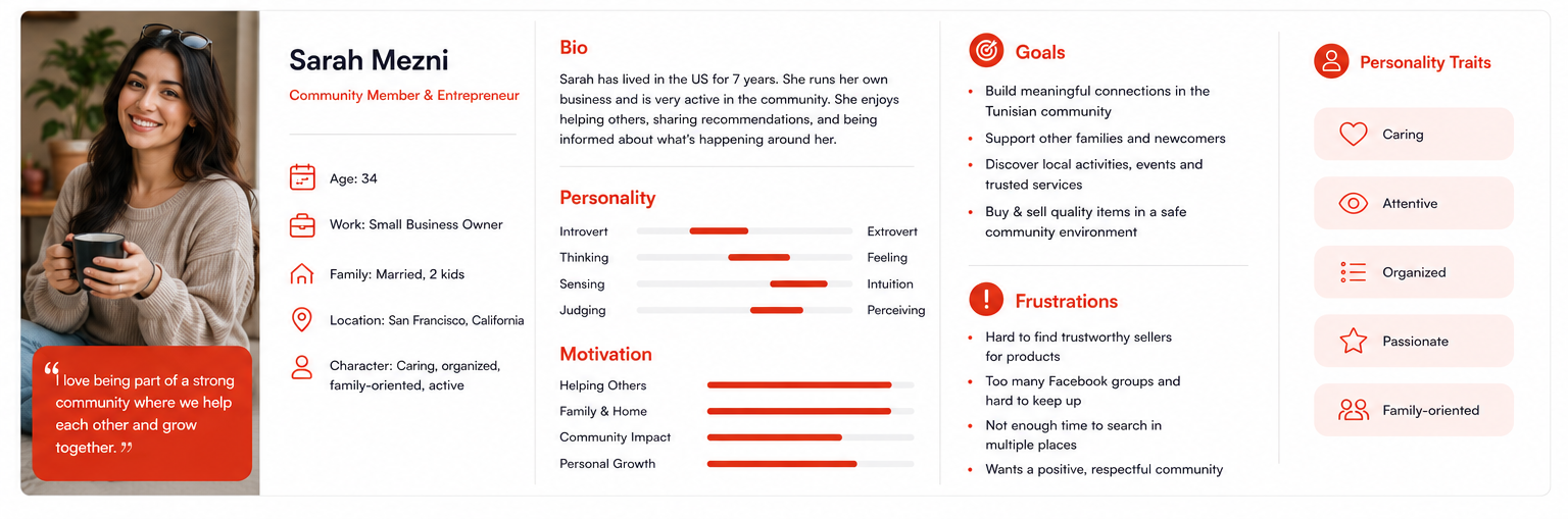
To better understand the needs of our target audience, I created user personas representing the app’s primary user groups. These personas served as a reference throughout the design process, helping prioritize features and create a more intuitive, community-focused experience.
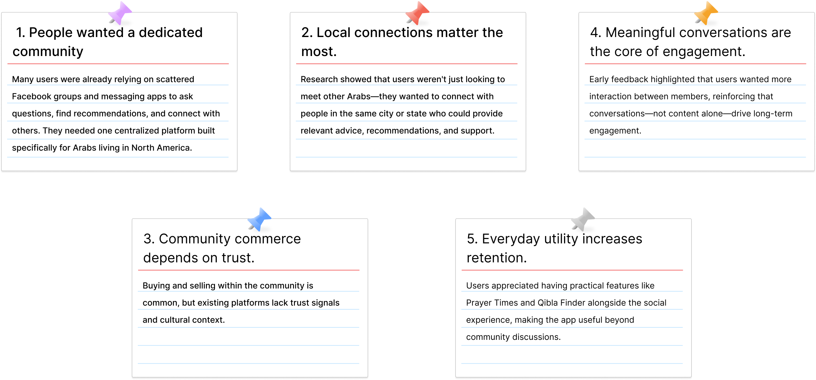
Key Insights
Information Architecture
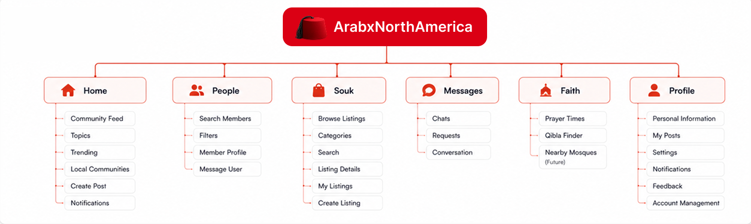
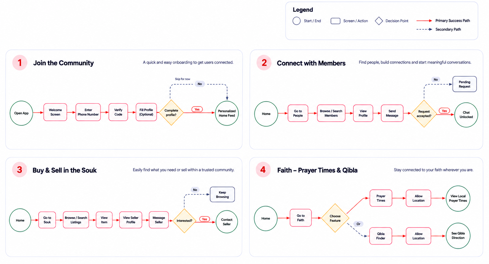
To establish a clear and intuitive navigation structure, I created an information architecture and mapped the application’s primary user flows. This process helped organize content, define relationships between features, and ensure users could complete their key tasks with minimal friction from onboarding to community engagement.
Sitemap
Organizing the app's content into a clear and intuitive structure.
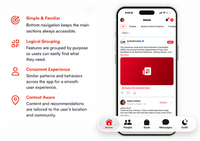
Navigation Strategy
Guiding users with a simple, consistent and intuitive navigation experience.
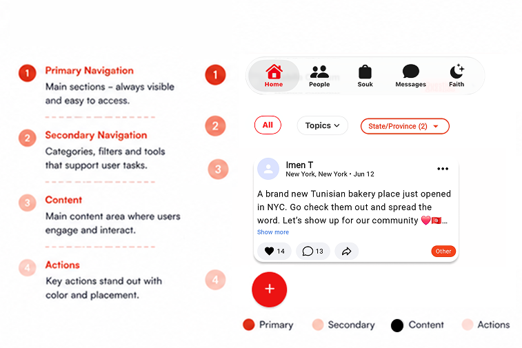
Visual Hierarchy
A clear hierarchy helps users scan, focus and take action with ease.
User Flow
Mapping the key journeys
I designed simple and intuitive user flows to help members complete their goals with minimal effort, while keeping the experience clear, consistent and enjoyable.
Sketches
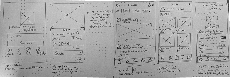
Early hand-drawn sketches helped us explore ideas, test layouts, and define the core structure of the app before moving into wireframes.
Wireframes
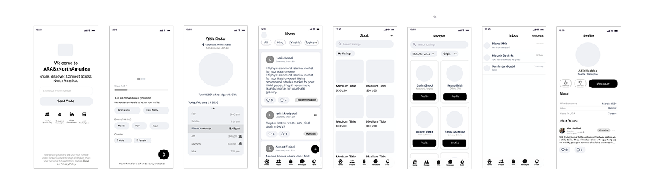
Low-fidelity wireframes were created to define the layout, hierarchy, and user flow without focusing on colors or visual details.
From Idea to Structure
Sketching and wireframing allowed us to iterate quickly, test ideas, and build a strong foundation for the final high-fidelity design.
Key Takeaways
- Explored multiple layout options before locking the structure
- Focused on clarity, simplicity and ease of navigation
- Validated the core flow before investing in visual design
UI Elements
Color
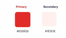
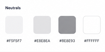
The color palette reflects energy, warmth, and trust. Red is used as the primary brand color to stand out, while neutrals keep the interface clean and balanced.
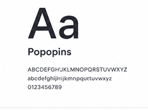
Typography
We use the Poppins typeface for its modern, friendly and highly readable look across all screen sizes.
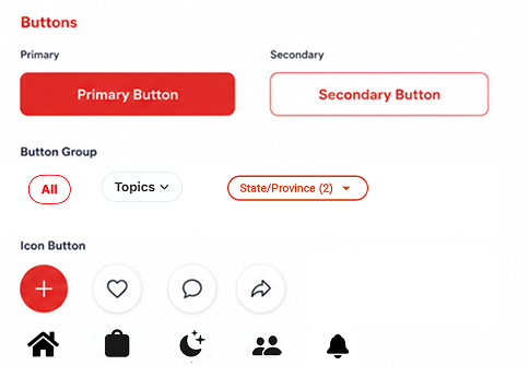
UI Elements / Buttons
Rounded corners, clear hierarchy, and consistent colors help create a friendly, trustworthy and modern experience.
Design Validation
Throughout the design process, I continuously reviewed the interface to ensure that core user journeys remained simple, consistent, and intuitive. Feedback from stakeholders and early users helped identify areas where navigation, information hierarchy, and interactions could be refined before development.
Post-Launch Validation
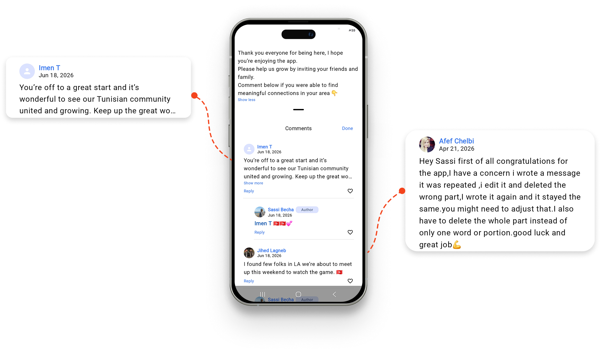
After launching ArabxNorthAmerica on the Google Play Store, I gathered feedback from early adopters across the United States and Canada. Their comments helped validate the product’s core value while highlighting opportunities for future improvements. This real-world feedback continues to shape the product roadmap and guide future design decisions.
Key Insights
Users found real community value
Many early users expressed appreciation for finally having a dedicated space where Arabs could connect, ask questions, and support one another.
"This is exactly the kind of community we needed."
The app helped newcomers feel less isolated
Several users immediately used the platform to introduce themselves, ask location-specific questions, and connect with nearby community members.
Faith tools became a differentiator
Multiple users specifically mentioned appreciating the integrated Prayer Times and Qibla Finder, validating the decision to combine practical utilities with social networking.
Opportunity for Growth
One recurring suggestion was encouraging even more interaction between members to strengthen the sense of community. This insight reinforced future opportunities around:
- Better community discovery
- More engagement features
- Richer conversations
- Local events and recommendations
Early User Feedback
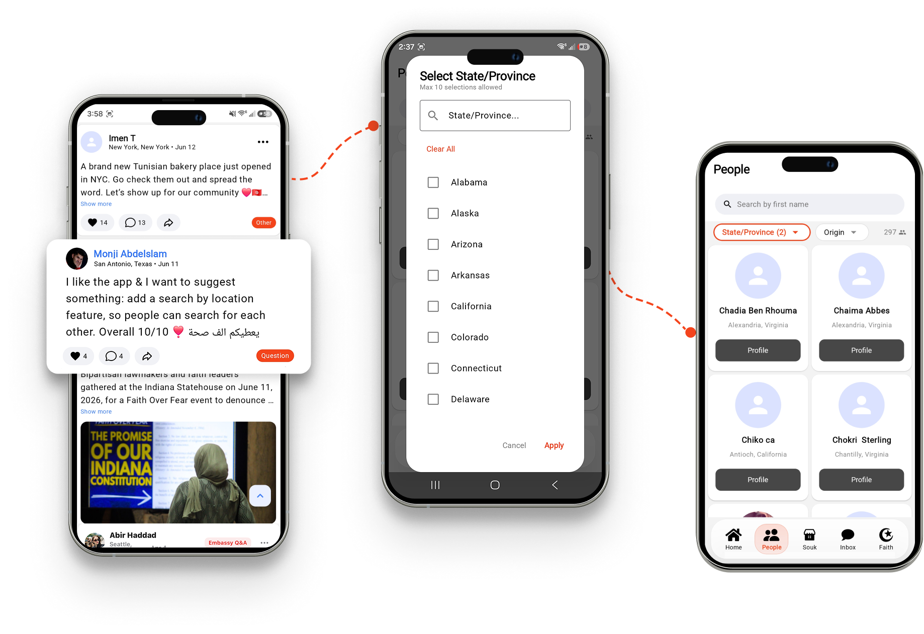
User suggested: Search by location
We're always listening.
Design Impact
Based on early feedback, the product successfully achieved its primary goals:
- Created a trusted space for Arabs living in North America.
- Enabled meaningful conversations between community members.
- Validated the value of combining social networking, marketplace, messaging, and faith tools in a single experience.
- Established a strong foundation for future feature iterations based on real user feedback.
The overwhelmingly positive response from early adopters confirmed that the product addressed a genuine need. Users particularly valued having a dedicated community space where they could connect, ask for help, and stay engaged with Arab life in North America.
Challenges
Balancing features. The biggest challenge was combining multiple products — social networking, marketplace, messaging, and faith tools — without making the interface feel overwhelming.
The solution was to simplify navigation and keep each feature focused on a single primary task.
Outcome
The final design delivers a centralized experience tailored to Arabs living across North America. Instead of switching between multiple apps and fragmented communities, users can connect, communicate, buy and sell, and access daily resources within one cohesive platform.
Reflection
This project strengthened my ability to design for niche communities and balance multiple product experiences within a single ecosystem.
More importantly, it reinforced that successful products aren’t built around features — they’re built around users’ everyday needs.